
css揭秘总结(三)
主要总结了书里的字体排版,用户体验,结构与布局。字体排版由于介绍英文比较多,这里就直接跳过了几个段落。 # 字体排印 ## 20. 连字符断行 CSS 文本(第三版)引入了一个新的属性 hyphens。它接受三个值:none、manual 和 auto。manual 是它的初始值,其行为正好对应了现有的工作方式:我们可以在任何时候手工插入软连字符,来实现断词折行的效果。 1
hyphens: auto;
21. 插入换行
通过 CSS 来插入换行的需求通常与定义列表有关。
利用伪类。
1 | dd + dd::before { |
22. 文本行的斑马条纹
背景知识: CSS 渐变,background-size,“条纹背景”,“灵活的背景定位”
难题
1 | tr:nth-child(even) { |
表格的“斑马条纹”,只需要一个伪类的选择就可以了。而文本呢。
解决方案
我们可以在CSS 中用渐变直接生成背景图像,为了让背景自动跟着内边距的宽度走,我们需要在解析 background-position时以 content box 的外沿作为基准。 1
2
3
4
5
6
7padding: .5em;
line-height: 1.5;
background: beige;
background-size: auto 3em;
background-origin: content-box;
background-image: linear-gradient(rgba(0,0,0,.2) 50%,
transparent 0);
23. 调整 tab 的宽度
难题
调整网页code的宽度。
利用新属性。
1 | pre { |
24. 连字
font-variant-ligatures来控制启用所有可能连字。
1 | font-variant-ligatures: common-ligatures |
25. 华丽的 & 符号
背景知识: 通过 @font-face
规则实现基本的字体嵌入我们通常会在 font-family 声明中同时指定多个字体(即字体队列)。这样,即使我们指定的最优先字体不可用,浏览器还可以回退到其他符合整体设计风格的字体。
在这个规则之下,如果有一款字体只包含一个字符(你肯定猜到是哪个了吧),那这款字体将只用于显示这个字符,其他字符会由字体队列中排在第二位、第三位或更后面的字体来显示。
1 | @font-face { |
还需要一个描述符,unicode-range,要查出你想指定的这些字符的十六进制码位。
1 | @font-face { |
26. 自定义下划线
背景知识: CSS 渐变,background-sizetext-shadow,“条纹背景”
难题
默认太丑,text-decoration: underline;。
border-bottom,会阻止正常的文本换行行为。box-shadow: 0 -1px gray inset;类似一样的会产生上述问题。
解决方案
最佳方案来自于background-image 及其相关属性。 1
2
3background: linear-gradient(gray, gray) no-repeat;
background-size: 100% 1px;
background-position: 0 1.15em;
新增: * text-decoration-color 用于自定义下划线或其他装饰效果的颜色。 * text-decoration-style 用于定义装饰效果的风格(比如实线、虚线、波浪线等)。 * text-decoration-skip 用于指定是否避让空格、字母降部或其他对象。 * text-underline-position 用于微调下划线的具体摆放位置。
27. 现实中的文字效果
背景知识:基本的 text-shadow
凸版印刷效果
1 | background: hsl(210, 13%, 40%); |
空心字效果
1 | background: deeppink; |
文字外发光效果
1 | background: #203; |
文字凸起效果
1 | @mixin text-3d($color: white, $depth: 5) { |
复古风格的排印效果
1 | @function text-retro($color: black, $depth: 8) { |
28. 环形文字
背景知识:基本的 SVG
解决方案
在 SVG 中,让文本按照路径排列的基本方法就是用一个
1 | $$('.circular').forEach(function(el) { |
用户体验
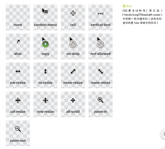
29. 选用合适的鼠标光标
难题
通过 cursor 属性来指定光标类型,比如 pointer 光标可以提示某个元素是可点击的,而 help 光标用来暗示这里有提示信息。
解决方案
提示禁用状态
1
2
3:disabled, [disabled], [aria-disabled="true"] {
cursor: not-allowed;
}隐藏鼠标光标
1
2
3
4video {
cursor: url(transparent.gif);
cursor: none;
}
30. 扩大可点击区域
难题
其可点击区域(热区)向外扩张往往也可以带来可用性的提升。没有人愿意对一个狭小的按钮尝试点按很多次。
解决方案
首先cursor: pointer,然后伪元素。 1
2
3
4
5
6
7
8
9
10button {
position: relative;
/* [其余样式] */
}
button::before {
content: '';
position: absolute;
top: -10px; right: -10px;
bottom: -10px; left: -10px;
}
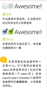
31. 自定义复选框
解决方案
当
由于 label 不是复选框那样的替换元素,我们可以为它添加生成性内容(伪元素),并基于复选框的状态来为其设置样式。然后,就可以把真正的复选框隐藏起来(但不能把它从 tab 键切换焦点的队列中完全删除),再把生成性内容美化一番,用来顶替原来的复选框!
试一试 1
2<input type="checkbox" id="awesome" />
<label for="awesome">Awesome!</label>1
2
3
4
5
6
7
8
9
10
11
12input[type="checkbox"] + label::before {
content: '\a0'; /* 不换行空格 */
display: inline-block;
vertical-align: .2em;
width: .8em;
height: .8em;
margin-right: .2em;
border-radius: .2em;
background: silver;
text-indent: .15em;
line-height: .65;
}1
2
3
4
5
6
7
8
9
10
11
12
13
14
15
16
17
18
19input[type="checkbox"]:checked + label::before {
content: '\2713';
background: yellowgreen;
}
/* 把原来的复选框以一种不损失可
访问性的方式隐藏起来 */
input[type="checkbox"] {
position: absolute;
clip: rect(0,0,0,0);
}
/* 聚焦或禁用时改变它的样式 */
input[type="checkbox"]:focus + label::before {
box-shadow: 0 0 .1em .1em #58a;
}
input[type="checkbox"]:disabled + label::before {
background: gray;
box-shadow: none;
color: #555;
}
开关式按钮
其实只需要把 label 设置为按钮的样式即可,并不需要用到伪元素。 1
2
3
4
5
6
7
8
9
10
11
12
13
14
15
16
17
18
19
20
21input[type="checkbox"] {
position: absolute;
clip: rect(0,0,0,0);
}
input[type="checkbox"] + label {
display: inline-block;
padding: .3em .5em;
background: #ccc;
background-image: linear-gradient(#ddd, #bbb);
border: 1px solid rgba(0,0,0,.2);
border-radius: .3em;
box-shadow: 0 1px white inset;
text-align: center;
text-shadow: 0 1px 1px white;
}
input[type="checkbox"]:checked + label,
input[type="checkbox"]:active + label {
box-shadow: .05em .1em .2em rgba(0,0,0,.6) inset;
border-color: rgba(0,0,0,.3);
background: #bbb;
}
32. 通过阴影来弱化背景
背景知识:RGBA 颜色
设置一个足够大的box-shadow 1
box-shadow: 0 0 0 50vmax rgba(0,0,0,.8);
作者推荐有限度地应用这个技巧,比如配合固定定位来使用,或者当页面没有滚动条时再用。
通过模糊来弱化背景
mask添加filter
34. 滚动提示
背景知识:CSS 渐变,background-size
给个网址:
https://www.w3cplus.com/css3/css-secrets/scrolling-hints.html
35. 交互式的图片对比控件
https://www.w3cplus.com/css3/css-secrets/interactive-image-comparison.html
结构与布局
36. 自适应内部元素
min-content 这个关键字将解析为这个容器内部最大的不可断行元素的宽度(即最宽的单词、图片或具有固定宽度的盒元素 1
2
3
4
5
6figure {
max-width: 300px;
max-width: min-content;
margin: auto;
}
figure > img { max-width: inherit; }
37. 精确控制表格列宽
只需: 1
2
3
4table {
table-layout: fixed;
width: 100%;
}
38. 根据兄弟元素的数量来设置样式
难题
在某些场景下,我们需要根据兄弟元素的总数来为它们设置样式。最常见的场景就是,当一个列表不断延长时,通过隐藏控件或压缩控件等方式来节省屏幕空间,以此提升用户体验。 ### 解决方法 利用两次伪类选择。 1
2
3
4
5
6
7
8
9
10
11
12
13/* 定义mixin */
@mixin n-items($n) {
&:first-child:nth-last-child(#{$n}),
&:first-child:nth-last-child(#{$n}) ~ & {
@content;
}
}
/* 调用时是这样的: */
li {
@include n-items(4) {
/* 属性与值写在这里 */
}
}
根据兄弟元素的数量范围来匹配元素
变量方式。 1
2
3
4li:first-child:nth-last-child(n+4),
li:first-child:nth-last-child(n+4) ~ li {
/* 当列表至少包含四项时,命中所有列表项 */
}1
2
3
4li:first-child:nth-last-child(n+2):nth-last-child(-n+6),
li:first-child:nth-last-child(n+2):nth-last-child(-n+6) ~ li {
/* 当列表包含2~6项时,命中所有列表项 */
}
39. 满幅的背景,定宽的内容
难题
在过去的几年间,有一种网页设计手法逐渐流行起来,我将它称作背景宽度满幅,内容宽度固定
解决方法
利用算术表达式 1
2
3
4.wrapper {
max-width: 900px;
margin: 1em calc(50% - 450px);
}
如果我们将长度值应用到父元素的padding上。 1
2
3
4
5
6
7
8
9
10
11
12
13footer {
max-width: 900px;
padding: 1em calc(50% - 450px);
background: #333;
}
.wrapper {}
/* 回退机制 */
footer {
padding: 1em;
padding: 1em calc(50% - 450px);
background: #333;
}
40. 垂直居中
基于绝对定位的解决方案
1 | main { |
基于视口单位的解决方案
1 | main { |
基于 Flexbox 的解决方案
1 | main { |
41. 紧贴底部的页脚
背景知识:视口相关的长度单位(参见“垂直居中”),calc()
calc() 函数
我们可以把元素包在一个容器里,然后在算式中就只需要考虑页脚的高度了: 1
2
3#wrapper {
min-height: calc(100vh - 7em);
}
更灵活的解决方案flex
1 | body { |
这 个 flex 属性实际上是flex-grow、flex-shrink 和flex-basis 的简写语法。 任何元素只要设置了一个大于 0 的flex 值,就将获得可伸缩的特性;flex 的值负责控制多个可伸缩元素之间的尺寸分配比例。举例来说,在我们眼前的这个例子中, 如 果 <main> 是 flex: 2 而<footer> 是 flex: 1,那么内容区块的高度将是页脚高度的两倍。如果把它们的值从 2 和 1 改为 4 和 2,结果也是一样的,因为真正起作用的是它们的数值比例。
- 本文标题:css揭秘总结(三)
- 本文作者:hddhyq
- 本文链接:https://hddhyq.github.io/2018/01/03/css揭秘总结三/
- 版权声明:本博客所有文章除特别声明外,均采用 CC BY-NC-SA 4.0 许可协议。转载请注明出处!